
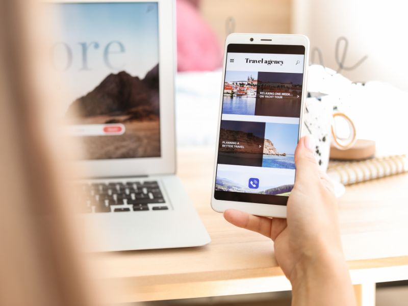
When you built your website (or hired someone to build it) did you ever consider the impact of your chosen desktop design on a users mobile phone? It is important to improve your website performance especially since the different sizes and element ratios look different on a desktop compared to a phone due to the smaller displays.
What’s more important is that 61% of consumers globally say they are more likely to buy from a website if it is mobile-friendly (WebFX). And 48% of Australians are shopping via mobile at least once a week (WebAlive).
Statistics like these are growing every year. It is becoming increasingly clear that if you don’t provide a good mobile experience, you’ll lose out to competitors who can.
Mobile-responsive website design
Responsive website design is when a website has been created in a way where the layout will adjust according to the size of the screen on which it is displayed.
There are three main sizes that websites should be responsive to, a desktop/laptop computer, a tablet and a mobile phone.
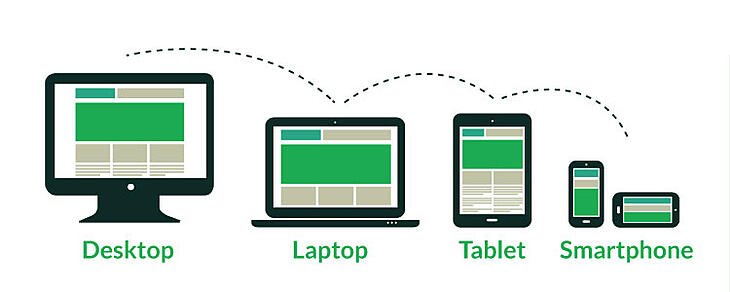
Responsive design ensures that a website will look good and be easy to navigate regardless of what kind of device is being used to browse.
All modern websites should be designed in this way. As business owners, we are typically used to looking at our own website on a desktop rather than a tablet or mobile as it’s easier to make changes via a computer rather than a mobile phone.
If your website is not responsive you will need to speak to a web developer about how you can update it. Depending on what content management system (CMS) you use you may be able to make some changes yourself.
Systems like Elementor on WordPress make responsive design relatively simple.
Testing your mobile responsiveness is fairly straightforward. Open your website on your phone and click through your own content as though you were a customer to ensure that it functions as it should. Click on every link and menu item – making sure the images fit on the page.
Do the same thing on a tablet or iPad if you have access to one. It is important to ensure the blocks of content and elements are arranged in an order that is functional for your customers.
Making contact easy on a mobile
Are your contact details on your website clickable (e.g. phone number and email address)? Making your contact information clickable on your website makes things just that little bit easier for those people browsing your website on mobiles.
Click-to-call
Here’s how to add a link to your phone number on the contact page, header and footer of your website so that visitors are prompted to call you when they click the number:
Option A – Using a hyperlink:
- View the page you want to edit in edit-mode
- Highlight the phone number or text you want to make clickable on mobile devices
- Click the “Hyperlink” button
- Enter tel:+61 and the area code (or 4 for mobile numbers), followed by your phone number with no dashes
Example:
Our number is 07 3103 6566, in the hyperlink we would type it as tel:+61731037994. The result is 07 3103 7994
The HTML code for this link is <a href=”tel:+61731037994>07 3103 7994</a>. If you want to test your code before you put it on your website, try this free tool.
Click-to-email
Here’s how to add a link to your phone email address on the contact page, header and footer of your website so that visitors who click your email address will be given the option to open a new draft email to you:
- View the page you want to edit in edit-mode
- Highlight the email or text you want to make clickable on mobile devices
- Click the “Hyperlink” button
- Enter mailto: and your email address
Example:
Our email is help@navii.com.au, in the hyperlink we would type mailto:help@tourismtribe.com. The result is help@tourismtribe.com.
Improve your loading time
The modern attention span is dwindling (source: Oracle 2020) and you need to be quick in order to capture and retain the attention of your audience.
According to Google, if your website takes longer than 3 seconds to load, you will probably lose about half of your potential customers then and there.
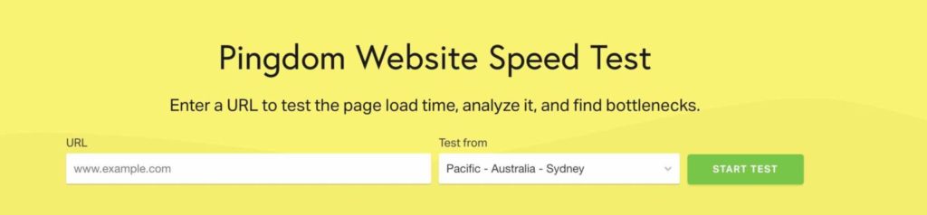
It is important to test the loading time for your website using tools.pingdom.com (set to Sydney as in the screenshot below) to ensure that there is nothing slowing it down.
If you find that your website’s loading speed is slow there are three key areas for you to consider:
- ensure the images on your website are as optimised as they can be and pay attention to the total size of the images on each page (i.e. too many large images = slow load speed_
- ensure unnecessary script doesn’t load on the page
- use caching
The 2 last bullet points above are the responsibility of your web developer, but the first one, once the site has been launched, is the job of the business owner and they need to learn to be proficient about images.
Improve your website performance on mobile devices
The key takeaway from this article is that is it vital to test, test, test your website on both desktop and mobile (and tablets too, ideally) to ensure that the content is easy to read, navigate, and looks the same as on your desktop/laptop.
Other best-practice ways to improve your website
Get rid of dead-ends: how to find broken links on your website
- Improve the SEO of your website and improve customer experience by learning how to find broken links on your website.
The correct way to review and update your website footer to increase conversions
- A well-designed website footer can serve as a safety net to keep visitors on your website. This article will show you how to update your website footer with the most important elements.
Conduct an easy SEO audit on your website
- Use this easy SEO audit on your website to ensure you rank on search engines such as Google as this will make sure your tourism business doesn’t remain the best-kept secret.
How To Resize Images to Help Reduce Your Websites Bounce Rate
- Having large images on your website will negatively impact its load speed. This article will help you to understand how to resize images for online use.
This article was first published on Navii, on September 17, 2021.
Why mobile matters more in the AI era
When an AI assistant recommends you and the traveller taps through, they almost always arrive on a phone. A site that does not fit the screen, with tiny text and buttons that miss, loses them before they book. They go back to the answer and pick someone else.
Google indexes the mobile version of your site first. The Google visibility that AI answers draw on is built on your mobile site, so a broken mobile experience drags down both at once. Mobile-friendliness is often the difference between an AI referral booking and bouncing.
How to check your site on a phone
Open your website on your own phone and look for text you have to zoom to read, buttons that are hard to tap, or content you scroll sideways to see. For a second opinion, run your address through Google’s free PageSpeed Insights (pagespeed.web.dev) and read the mobile result. Good looks like text readable without zooming, buttons easy to tap first time, and no sideways scrolling.
Frequently Asked Questions
How do I know if my website is mobile friendly?
Open it on your own phone and try to read and tap around. If text is tiny, buttons are hard to hit, or you scroll sideways, it is not. For a second opinion, run your address through Google PageSpeed Insights and check the mobile result.
Does being mobile friendly affect whether AI recommends me?
Indirectly, yes. Google indexes your mobile site first, and AI answers lean on Google’s view of you. A poor mobile site weakens that, and it loses the AI-referred visitors who arrive on a phone and cannot book.
Can I make my site responsive myself?
Sometimes. If your theme has responsive settings, you may be able to fix it in the template. Often it is a build-level job, so ask your web developer to make the site responsive or switch to a responsive theme.
My site looks fine on my laptop, so isn’t that enough?
No. Most travellers sent by an AI assistant arrive on a phone, not a laptop. Always check any change on a phone as well as on your desktop.
Your free AI marketing coach, right in your pocket
The free Pocket Rocket app gives you a personal AI marketing coach, website audit, weekly action plans and 5-minute tips. Built for tourism operators.