Best practice elements of a Tourism Contact Us page

How to build a contact us page that actually gets guests to reach out
Your Contact Us page is more than just a way to let people know you’re open for business. It’s your online front desk — the digital version of a friendly wave and a “How can I help you today?”
For most tourism operators, it’s one of the most-visited pages on the website and the last stop before a potential guest decides to book, enquire, or give up and head elsewhere. So, if your contact page hasn’t had a refresh in a while, it’s time to take a closer look.
Because a great contact page isn’t just about putting your phone number online — it’s about creating a smooth, trustworthy experience that matches the warmth of your in-person hospitality.
Why your contact us page matters
In the early days, most businesses only dealt with guests via phone or post. Now, travellers expect instant access, mobile-friendly design, and quick, friendly responses — whether that’s through your website, email, or social DMs.
A well-built Contact Us page:
- Makes it easy for guests to reach you their preferred way
- Builds trust and shows you’re a real, professional operator
- Reduces friction in the booking journey
- Reinforces your brand voice and customer service values
- Encourages direct bookings (instead of third-party OTAs)
If you’ve already improved your About Us page, you’ll notice the same principles apply — personality, clarity, and reassurance go a long way. (If you haven’t yet, check out our blog “How to build a great About Us page that connects with your guests” for tips.)
Not sure how your current website stacks up? Our Digital Engagement Health Check™ can assess your digital presence and show you practical ways to improve it — including how well your contact page supports your guest journey.
What every tourism contact us page should include
Before you get fancy, make sure you’ve nailed the basics. A best-practice tourism contact page should have:
- Opening hours — when people can expect you to respond or when your reception is open.
- Phone number — make it click-to-call on mobile.
- Email address — don’t rely on a form alone; people still like to see a real address.
- Physical or mailing address — with a Google Maps link or embedded map.
- Booking button — a clear, prominent link to your “Book Now” page.
- Simple contact form — include name, email, phone, message, and optional enquiry type or preferred dates.
- Confirmation message — so people know their message was sent successfully.
- Directions — parking, nearby public transport, or nearest airport/train/bus stop.
- Average response time — e.g. “We reply within 24 hours.”
- Social media icons — Instagram, Facebook, TripAdvisor, YouTube, LinkedIn.
- Accreditation logos — eco-certifications, memberships, or trust badges.
- Accessibility information — a must for inclusive and ethical tourism.
- A friendly image — your team or entrance to reassure guests you’re real people.
Don’t forget accessibility
This one’s worth repeating. The accessible tourism market is growing rapidly, and Australia’s ageing population means more travellers are seeking businesses that understand their needs.
Almost one in five Australians live with a disability — and 90% of them take a holiday each year. That’s a massive opportunity, but more importantly, it’s the right thing to do.
Be upfront about your accessibility features. Include a short statement or link to more details about your facilities, support options, or any inclusive initiatives. Don’t make potential guests email you just to ask if they can visit comfortably.
You can include this info on your Contact page, in your FAQs, and on your product or accommodation pages.
Make it interactive and personal
Travellers love seeing where you are and who they’ll meet. Embed a Google Map showing your location, include written directions for those who prefer step-by-step, and add a friendly photo of your team or entrance.
If you have WhatsApp, Messenger, or live chat, make those options visible. Guests today expect more than just a phone number — they want instant, human communication.
Bonus tip: test it regularly
Pretend you’re a guest and go through your Contact page on your mobile.
- Does the form send properly?
- Are links clickable?
- Is the map easy to zoom?
- Does your confirmation message actually appear?
If not, fix it. Because if you find it frustrating, your guests definitely will.
If you’d like step-by-step help improving your tourism website, our course Make your website the best it can be is a great place to start. You’ll learn how to create pages that convert visitors into bookings and make your customer service shine online.
Quick checklist for your tourism contact page
- Opening hours
- Click-to-call phone number
- Visible email address
- Google Map or directions
- Booking button
- Short, friendly form
- Accessibility information
- Social links and accreditations
- Team photo or property image
- Confirmation message
- Response time
Tick all those off, and you’re already ahead of most tourism operators.
Final thought
Your Contact Us page isn’t just a technical requirement — it’s your online handshake. It’s where potential guests decide if they feel comfortable reaching out, if you seem trustworthy, and if you’re easy to deal with.

Your free AI marketing coach, right in your pocket
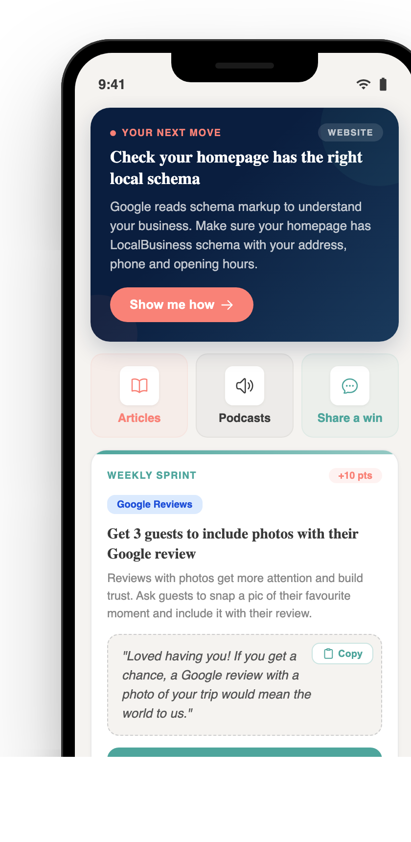
The free Pocket Rocket app gives you a personal AI marketing coach, website audit, weekly action plans and 5-minute tips. Built for tourism operators.

